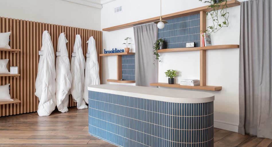
The Power of Entrance/Exit Displays
First impressions are everything. The human mind is built to make quick judgements, and psychologists will tell you that initial impressions are the ones that last the longest. This is why it’s so important that brands put a lot of thought into their entrance and exit displays. Whether a customer enters your store with a plan to purchase, or just randomly stops in, the first impression will lead them to browse further or turn around and exit.
Six Tips to Improve Your Entrance and Exit Displays
During holiday shopping this is even more important because shoppers tend to be time strapped, and they are more hasty in their assessment of a shop. They think: “Will this be a sound investment of my time?” as they decide quickly with thoughts of their next destination. To encourage your visitors to explore further, consider these tips:
Keep the Landing Zone Clean.
The area just inside the entrance, called the “landing zone”, is a vantage point that allows the customer to take in the store’s overall look and feel – its ‘vibe”. This space needs to be open, clean and neutral – free of product and clutter.
When a customer walks in, leave enough open space to make them feel comfortable rather than cluttering your landing zone with displays or holiday decoration. Instead, make sure the eyelines are clear so that the holiday displays around the perimeter are visible, include enough holiday décor to remind the shopper that they are on a mission to purchase, and give them a welcoming, festive feel.

Keep Signage Straightforward and Bold.
The garland and lights certainly tell newcomers that the holidays are upon them, but signs are also a great way to bring the brand and the holiday season together in a graphical way.
Remember, you have very little time to catch the eye as customers walk past, or into, your store, and it pays to make the few seconds of this interaction count.
Use signage in different and interesting ways to convey holiday enthusiasm in your windows and in the landing zone.
Our graphics department are experts in transforming spaces using an arsenal of grand-format printers to deliver on your vision.
Be Consistent with Your Branding.
Your entrance displays and your holiday displays should project the tone of your brand and what it represents. Give your customers a clear vision of not only what you’re selling, but the deeper values and ideas that help them connect with you on a more personal level.
When they see your storefront and when they walk into your store, they should immediately feel your brand. Giving holiday displays a brand angle by using a color palette or shape that is immediately recognizable as “your brand” is an excellent way to carry your branding through.
Learn more about how to connect displays to branding here.
Be Inspirational, Aspirational, and Relevant.
A good entrance display makes people feel things. It helps them relate to your brand, and shows them that you know what they like and want. Clothing stores do well showing complete, styled outfits in action. Home stores show beautifully-decorated table-scapes or furniture setups.
Aside from everyday shopping needs, customers have seasonal and “trending” shopping behaviors that are related to the timing of events, holidays and seasons. Create environments that help your customers see themselves using your brand.
Guide the Customer Shopping Experience.
Use the entrance’s complete view of the store to guide your shopper. To draw them inside, entice them with festive holiday window displays. To encourage browsing use festive-themed holiday wayfinding.
After all, holiday displays are an art and a science, and to truly capture the essence of the season, planning matters.
Don’t Forget the Exit Experience.
Customers like to return to stores where they have had a good experience. On the way out, leave your customer with good (festive) memories to carry them to their next destination. Make sure that you have opportunity fixtures near the checkout – especially during the holidays when stress levels are high and customers are often looking for that one last item while the checkout clerk is ringing them up. As they leave your store, provide exit messaging that incentivizes a future visit.
Custom Retail Fixtures to Make the Space from Morgan Li
Whether you’re planning for the holidays or seeking long-term merchandising solutions, you need a partner to make your vision a reality. That’s where we come in. With half a million square feet of domestic production space and eight decades of experience, Morgan Li is trusted to take on the biggest plans and boldest challenges. From concept to rollout, we work with you to deliver fixtures, furniture, and graphics on time and on budget.
Whatever you’re looking to make, whatever experience you want to create, we’ve seen it, done it, and delivered it.
Get to know more about who we are, how we work, and who we’ve helped—and contact us to request a quote.


